Thursday, February 24, 2011

THE GENIUS OF DESIGN Part 4

Better living trough chemistry

At the beginning of this part of the documentary it tells about the new ways of design with the implementation of the use of plastic. In America the development of Tupperware was finished and introduced to the public in 1946 by earl Silas Tupper. He developed plastic containers used in households to contain food and keep it airtight. The formerly patented "burping seal" is a famous aspect of Tupperware, which distinguished it from competitors.


But the Tupperware did not have much marked in Europe that was suffering from the Second World War.  Germany was destroyed, and designers, including Dieter Rams wanted to create a new and better world with a clean and minimalistic design, where forms follows function.

The idea of the design was to take away what was unnecessary, and to get the pint of what is.
And to design something that was exactly what is was supposed to be, and not an awful lot more.
This minimalistic way of designing is still very essential today.


As the car became more and more common for everyone, not only the roads needed an upgrade, but also the signs. They clearly are inspired by the minimalistic and functional way of thinking. Developed by the british graphic designer Margaret Calvert, she designed signs that were clear and simple to read and became a symbol of changing times.


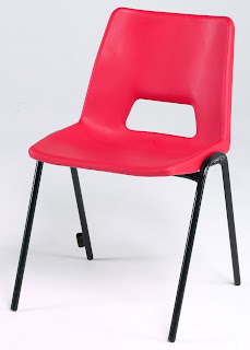
Even today, after 50 years designer are trying to create something similar to the successful Polyprop chair, By Robin Day from 1963 which has had 14 million sales. With the same qualities like: 
stackable, light, strong, washable, comfortable. This was a chair that was perfect for public buildings because of i'ts low cost and the easy production. 

As quite a contract to the polyprop chair, Verner Panton wanted to create something completely different to what that earlier had been made. He created an innovating chair that was the first chair that was designed as just one piece of plastic, with no legs. 


ARE WE LIVING IN A PLASTIC WORLD???!!!!!


AND IS PLASTIC FANTASTIC?!?


THE GENIUS OF DESIGN PART 2;


THE GENIUS OF DESIGN
Part 2

Design for living

The second chapter deals with the difference of being an designer and an architect and the relationship between us and our things – on how design joins people together.

Founded my Walter Gropius, Bauhaus, a German art school was going to make the vision for the young designers to reshape the world come trough. All types of designers were brought together, to an open environment where they all could work together and learn from each other. A place where artist learned from the construction workers, and the construction workers learned from the artists. This became a vision for a new kind of life, a new future. Bauhaus became a centre of new thinking.


 As an enormous contrast to this industrial look the style of art Nouveau, the biggest enemy, had became the dominant design style, with is organic, decorative and sensual design. If you compare the design from the Bauhaus movement with the Art Nouveau style, is became clear that the simple and modernistic look would make it possible for easier and cheaper production for many people as possible. 


New technology made it possible to produce tubular steel. This opened up a whole new field of shapes. Tubular steel was mainly used on the chair were it became half structure, half product.


In terms of architecture, Le Corbusier was concerned about how to create a better life for the whole family. the modern family. He went a step further then the fitted kitchen and designed a fitted house,  a machine to live in, inspired by the train. It is important to connect his houses with the train, that symbolizes modern traffic and the future. He designed flexible and smart solutions for the apartments, that bade it possible for the residents to change the interior of the apartment after what was suited for the family


With a vision to change the American style of design, Le Corbusier moved to America. But the design and future was already chosen by capitalism, individualism and consumerism.
American designers much more pragmatic then European designers, and is much more after the main stream, because that is where all the money was  


THE GENIUS OF DESIGN,

PART 1
GHOSTS IN THE MACHINE

The first episode of this chaptered documentary is about the industrial world- the world the designers have made for us.

What does it mean to be a designer?

A designer is a person that worries about the things we surround us with in our daily life. They are concerned about define details, so we don’t have to. Things are designed to make a better world for the small things.


A famous designer, Dieter Rams means that good design is as little design as possible and should be as decreet as an English butler.
Here is some of his design principles about what is good design: 
- Innovative
- Useful
- Esthetic
- Honest


The role of a designer has changed with the development, like: capitalism, industrialization, mass production, new materials, new technology, globalization, etc. But before the mass production and industrialization things were hand made by craft men in small workshops, where every piece that was made was a little bit different from its siblings.


To day in terms of cars, a designer for Ford states that there is a car for everyone, back in the days, when Henry Ford invented the Model T the saying was a bit different; “ the same car for everyone”.

The biggest issue today is that we always tend to want a bit more. A little more comfort, a little better, or a little bigger, so new product today is always designed to be just that; a bit more comfortable, a little better and a bit more desirable then the previous version 


Sunday, February 13, 2011

"When is an object beautiful?"


"When is an object beautiful?"

Design Theory: Philosophy
After a discussion in the group we concluded with that an object is beautiful when it fulfills these design criteria's:

Balance
Harmony
Rhythm
Symmetry
Proportion
Scale
Shape

Monday, December 6, 2010

Design theory: Palladio, Late Renaissance: Universal grammar

• Palladian architecture began in the early 1500s and is a European style of architecture derived from the designs of the Italian architect Andrea Palladio (1508–1580).
• Andrea Palladio was a late renaissance architect who was the last great architect to derive contemporary buildings from ancient architecture.
• Palladio created carefully proportioned, symmetric buildings that became models for private homes and government buildings in Europe and America.
• Famous for his grand, orderly look.
• In 1570 he published his masterwork Four Books on Architecture where Palladio suggests that the lengths of a room should be the harmonic or geometric mean of the height and width of that room.
• Palladio used principles that related to art and forms that related to nature to generate his architecture.
• He is known as a Renaissance master and the most influential and most copied architect in the Western world.

Palladio’s principles:
Grid definition
Exterior wall realignment
Room layout
Interior wall realignment principal entrances‐porticos and exterior
Wall inflections exterior ornamentation‐ columns
Windows and doors
Termination

One of his most famous is Villa Capra, also known as the Rotunda, was modeled after the Roman Pantheon. Villa Capra is a completely symmetrical building with a square plan and four facades. The name Rotunda refers to the villa's circle with an intersection of a square with a cross.


External view of Villa Capra


Floor plan of Villa Capra


The stages

Tuesday, November 16, 2010

The design elements and principles


THE NORWEGIAN OPERA HOUSE IN OSLO
The design elements and principles


In this view of the exterior of the Norwegian Opera House in Oslo, there is lines going in both vertically and horizontally that creates a dramatic and expressive shape, that almost look like an iceberg. The combination of the vertical and horizontal lines creates a great balance to the exterior of the building. 


Parts of the façade is covered with a aluminum cladding with a pattern of blind print, which gives a textured finish get an exiting effect by light and shadows that creates a rhythm in the pattern that changes during the day.  The two volumes appear like two cubic igloos that create unity with the “ice shape” of the building.


The way the building is designed makes it possible for visitors to walk all over the building. You can even walk on the sloping roof all the way to the top, which creates a lot of exiting spaces for the audience to explore.  The sloping walls on both sides that lead you up to the highest roof level gives a nice proportion to the architecture of the Opera house.